
Ton launches a new visual identity: the logo will lose the chair but gain a circle
-
Published
2 Apr, 2024 -
Text by
Iva Šimoníková -
575 words
3 minutes
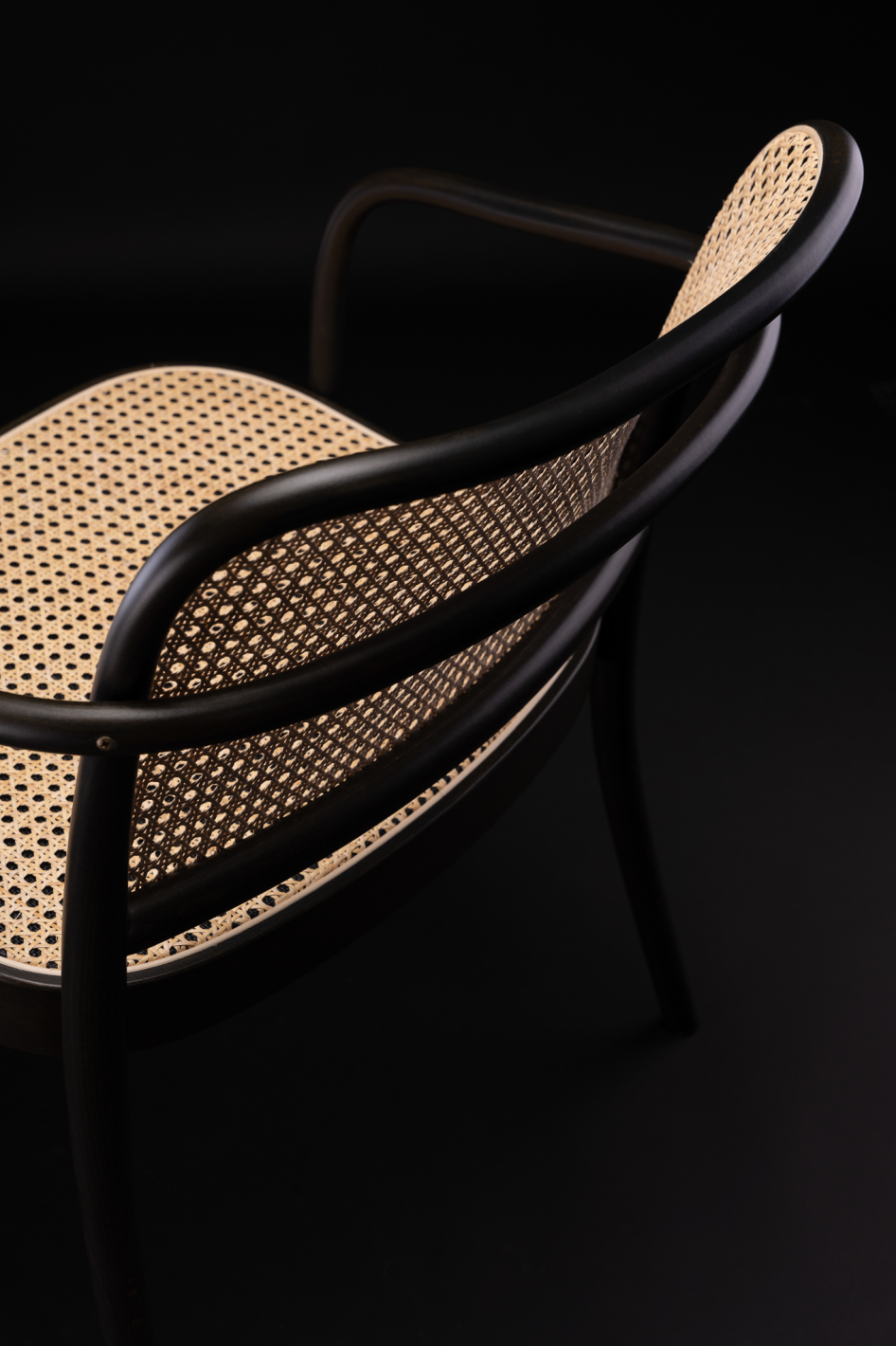
After twenty years, we have decided to change our visual identity. There will be several new elements: firstly, the company name will no longer be written all in capitals. The logo has also shed the famous Number 14 chair, the symbol of bentwood furniture which, however, invokes only part of our product portfolio. The logo’s new focal point is the detail on the circular central letter “o”.
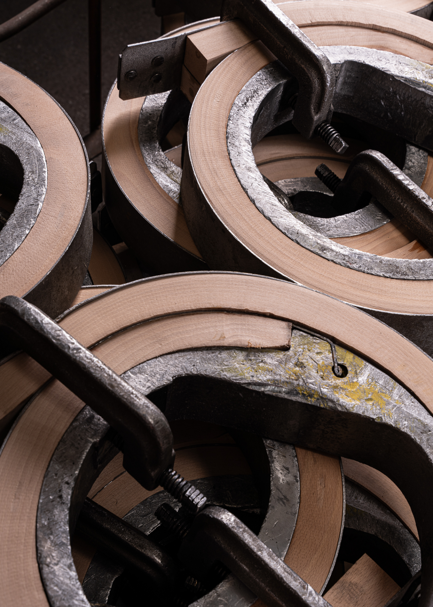
A machine developed in Bystřice pod Hostýnem
The circle has several meanings. It symbolises both the bend in the wood and also sustainability, perfection, and the family circle, in which our products – be they chairs, tables or accessories – often feature. However, the sádlík machine, named after its inventor, is the main inspiration for the circular element in the new logo. Developed in Bystřice pod Hostýnem in the mid-twentieth century, this machine is used to form circular bends and put the curve into planks; it quickly became a crucial tool for bending wood for seats and leg joints. This makes it a symbol of our innovative approach.
![]()
The logo was designed for Ton by the Austrian designer Ewald Neuhofer, and fine-tuned by the Viennese studio Bueronardin. Along with the new visual identity, we are also launching the typeface Matter SQ, by Martin Vách of Czech type foundry Displaay. The font’s vivid forms and diagonal terminals give it a pleasingly gentle touch. It is also easier to read in electronic format, which will delight visitors to Ton’s new website.
Our attractive, sophisticated new configurator
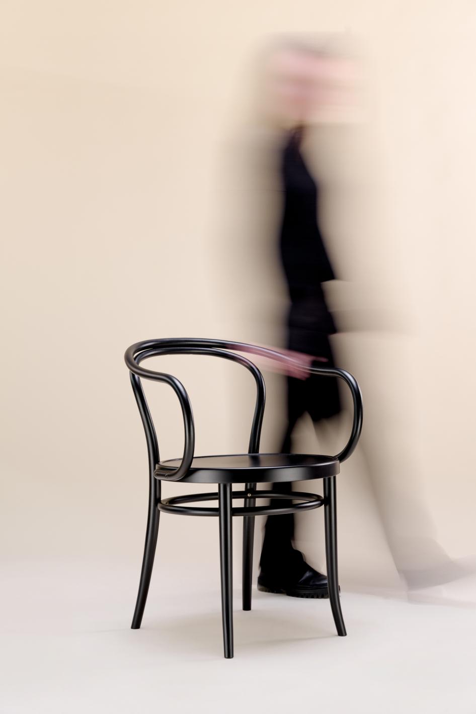
We analysed the requirements of Ton’s sales and reseller agents around the world and used the results to build our new website. That is why it now has an interactive furniture configurator, which can be used to adjust the product to the exact variant desired by the customer, including colour, wood type and and upholstery. The website also contains a great many historical photos as well as the fascinating story of bentwood products, a technology unsurpassed even today, for which human hands are still needed.
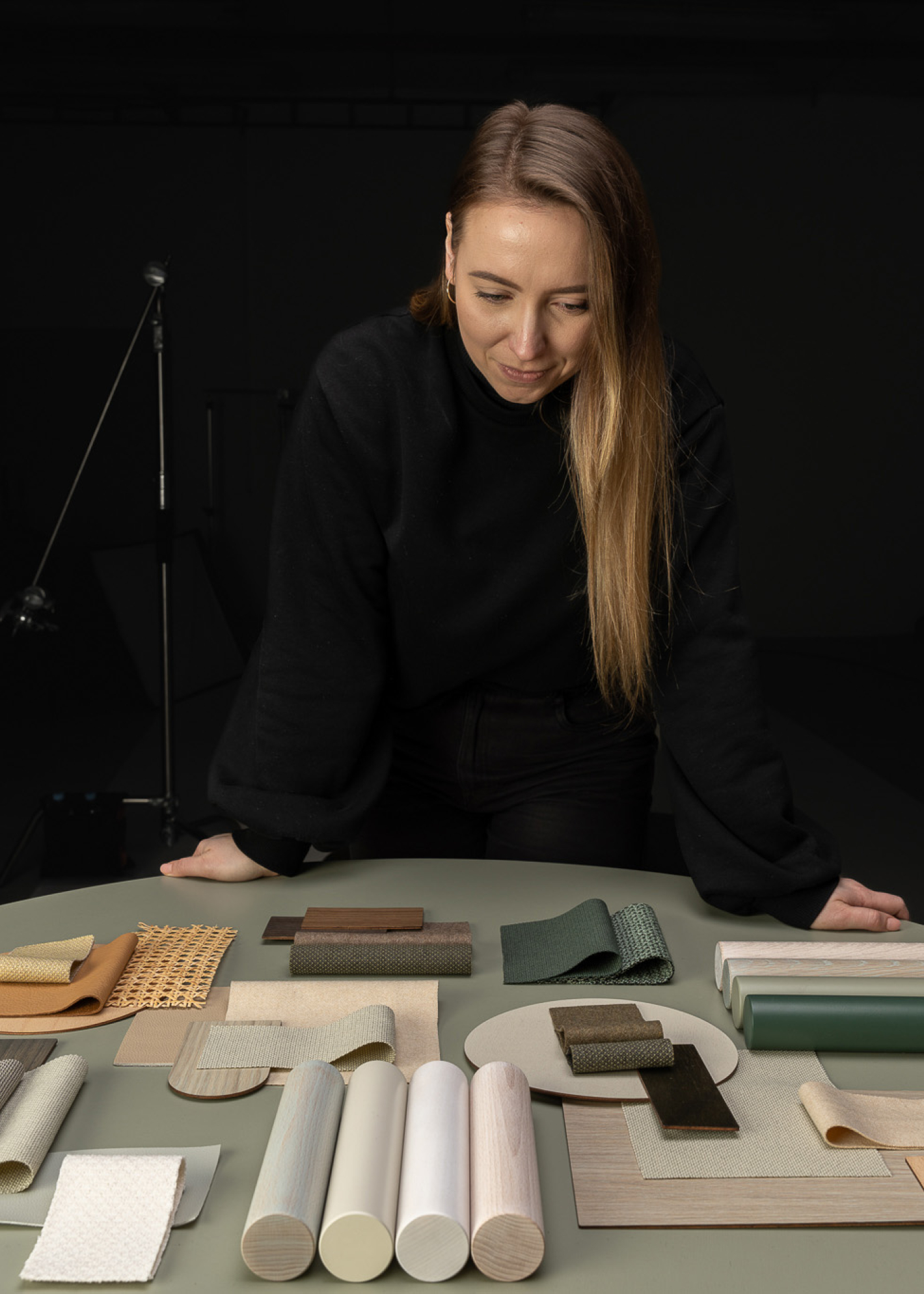
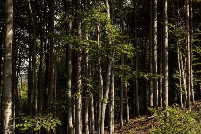
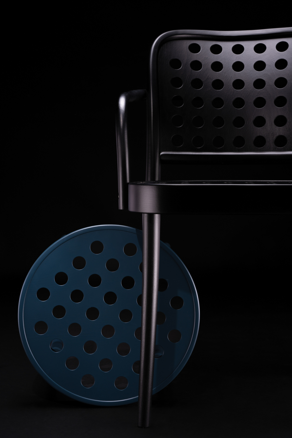
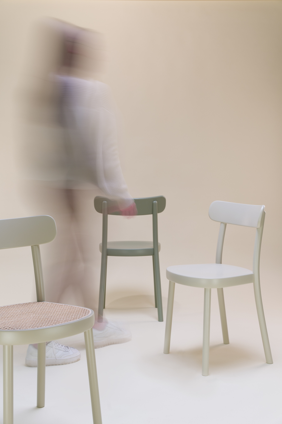
The company’s new visual identity also includes new colours and materials that do not mimic rapidly changing fashions, but rather epitomise the essence of Ton. In addition, it is now easier to combine the colours with each other. The person behind the colour concept, visual manager Zuzana Piliarová, sought inspiration directly from the factory site. She chose colours that reflect the product’s character – blue like the t-shirts worn by her colleagues in the factory, brick-red like the old factory buildings and green and yellow from the surrounding landscape, a continuous source of inspiration for her.
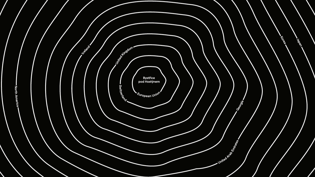
Ton’s headquarters in the heart of Europe – the Czech Republic
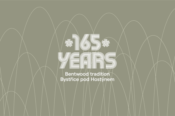
Production in Bystřice pod Hostýnem has a long history began back in 1861, when the bentwood furniture factory was established in Bystřice pod Hostýnem in the heart of Europe. The German innovator Michael Thonet founded his own company with his sons, who continued to develop the business after their father’s death. The Bystřice pod Hostýnem factory can pride itself on uninterrupted production of bentwood furniture on one site for over 160 years, making it unique in the sector. All Ton products are still manufactured exclusively in the Czech Republic.